Economic Indicator Decline Following the Declaration of Martial Law(24.12.03)
– Data Visualisation
Let’s Start Our Journey
Just when you think the world is running smoothly, something unexpected explodes somewhere. This time, the word “Insurrection(Coup)” dominated the news. And that’s in 21st century South Korea. Facing this situation, I wanted to approach it a bit differently. Getting angry wouldn’t really accomplish anything I could actually do. So I decided to respond in my own way - recording the impact of this event through data.
That’s why I turned my attention to economic indicators. Unlike politicians’ rhetoric, numbers like market capitalisation, exchange rates, and foreign investment trends show objective facts through data. Of course, how we interpret and contextualise those numbers is another matter, but at least the raw data reflects reality as it is.
flowchart TD
    Start([Starting Point]) --> A

    A["🏛️ Political Event<br/>(Martial Law Declaration)"]
    --> A1{Impact Spread}

    A1 --> B1["📉 Market Cap Decline"]
    A1 --> B2["📈 Exchange Rate Rise"]
    A1 --> B3["💰 Other Economic Indicator Changes"]

    B1 --> C
    B2 --> C
    B3 --> C

    C["📊 Data Collection & Visualization"]
    --> C1["Chart.js Chart Creation"]
    --> C2["Remotion Video Production"]
    --> D["✅ Objective Evidence Presentation<br/>Proof of Actual Economic Impact"]

    %% Style definitions
    classDef startEnd fill:#f9f9f9,stroke:#666,stroke-width:2px
    classDef political fill:#ffcdd2,stroke:#c62828,stroke-width:2px
    classDef decision fill:#fff3e0,stroke:#ef6c00,stroke-width:2px
    classDef economic fill:#e1f5fe,stroke:#0277bd,stroke-width:2px
    classDef process fill:#f3e5f5,stroke:#6a1b9a,stroke-width:2px
    classDef evidence fill:#e8f5e8,stroke:#2e7d32,stroke-width:2px

    class Start,A1 startEnd
    class A political
    class A1 decision
    class B1,B2,B3 economic
    class C,C1,C2 process
    class D evidence
I happened to see a report published by Research Institute from the Korea Democratic Party(Minjudang), which was a detailed publication in the form of tables and text. However, since this high-quality material was tucked away as a PDF attachment in a corner of the party research institute’s bulletin board, I thought it would be great if this important data could be delivered to more people in an easily understandable way.
So I decided to visualise this data using the web technologies I usually work with. What’s the point of studying data visual design if I don’t use it at times like this? This is also one of the reasons I entered a master’s program in data analysis. Because data storytelling in life and politics is now inseparably connected.
Layout Design: The Process of Structuring Ideas
To implement the ideas in my head, I first conceived the layout. Rather than meticulously designing in Figma during the brainstorming stage, I usually just quickly sketch ideas and then convert them to Mermaid or ASCII. I simply structured it with ASCII art rather than complex tools.
Version 1: More Detailed
graph TB
    subgraph MAIN ["Main Content Area"]
        subgraph LEFT ["🕒 Timeline Navigation (1/4)"]
            Event1["📅 2024-12-03<br/>Yoon Seok-yeol Martial Law Declaration<br/>👆 Clickable"]
            Event2["📅 2024-12-04<br/>Martial Law Repeal Resolution<br/>⚪ Unselected"]
            Event3["📅 2024-12-07<br/><br/>⚪ Unselected"]
            EventMore["⋮<br/>More Events"]
        end

        subgraph RIGHT ["📈 Selected Event Details (3/4)"]
            EventDetail["🎯 December 3, 2024<br/>President Yoon Seok-yeol's Martial Law Declaration"]

            subgraph CHARTS ["📊 Major Economic Indicator Changes"]
                Chart1["📈 Market Cap Chart<br/>[Chart Area]"]
                Chart2["💱 Exchange Rate Chart<br/>[Chart Area]"]
            end

            subgraph IMPACTS ["💥 Additional Impact"]
                Impact1["• Foreign investors net sold 1 trillion won"]
                Impact2["• Consumer sentiment index dropped 12.5%"]
                Impact3["• Gold prices surged"]
            end
        end
    end

    %% Interaction representation
    Event1 -.->|Click to update| EventDetail
    Event1 -.->|Data linkage| CHARTS
    Event1 -.->|Related info| IMPACTS

    %% Styling
    classDef headerStyle fill:#2E86AB,stroke:#A23B72,stroke-width:3px,color:#fff
    classDef timelineStyle fill:#F18F01,stroke:#C73E1D,stroke-width:2px,color:#fff
    classDef detailStyle fill:#FFE66D,stroke:#FF6B35,stroke-width:2px,color:#000
    classDef chartStyle fill:#06D6A0,stroke:#118AB2,stroke-width:2px,color:#000
    classDef impactStyle fill:#EF476F,stroke:#F72585,stroke-width:2px,color:#fff
    classDef selectedStyle fill:#7209B7,stroke:#560BAD,stroke-width:3px,color:#fff

    class HEADER headerStyle
    class LEFT timelineStyle
    class RIGHT detailStyle
    class CHARTS,Chart1,Chart2 chartStyle
    class IMPACTS,Impact1,Impact2,Impact3 impactStyle
    class Event1,EventDetail selectedStyle
Version 2: More Structural
flowchart LR
    subgraph Main["📊 Timeline Dashboard Layout"]
        direction TB

        subgraph Row1["Header Row"]
            H1["🎯 Header Area"]
        end

        subgraph Row2["Main Content Row"]
            direction LR

            subgraph Col1["⬅️ Left Column<br/>(Timeline Events)"]
                direction TB
                L1["📅 2024-12-03<br/>Martial Law Declaration"]
                L2["📅 2024-12-04<br/>Repeal Resolution"]
                L3["📅 ...<br/>More Events"]
                LScroll["📜 Scrollable"]

                L1 -.-> L2 -.-> L3 -.-> LScroll
            end

            subgraph Col2["➡️ Right Column<br/>(Event Details)"]
                direction TB

                subgraph DetailHeader["📋 Event Header Section"]
                    RH["Selected Date, Name"]
                end

                subgraph TabSection["🔍 Tab Navigation Section"]
                    RT["Key Indicators<br/>(Market Cap/Exchange Rate/Crypto...)"]
                end

                subgraph ChartSection["📈 Chart Section"]
                    RC["Selected Indicator<br/>Chart & Analysis<br/>Chart Area"]
                end

                subgraph MessageSection["💡 Key Message Section"]
                    RM["Core Message<br/>"]
                end

                DetailHeader --> TabSection
                TabSection --> ChartSection
                ChartSection --> MessageSection
            end
        end

        Row1 --> Row2
        L1 -.->|Click| RH
        L2 -.->|Click| RH
        L3 -.->|Click| RH
    end

    classDef headerClass fill:#bbdefb,stroke:#1976d2,stroke-width:3px
    classDef leftClass fill:#c8e6c9,stroke:#388e3c,stroke-width:2px
    classDef rightClass fill:#ffe0b2,stroke:#f57c00,stroke-width:2px
    classDef keyClass fill:#ffcdd2,stroke:#d32f2f,stroke-width:3px

    class H1,DetailHeader headerClass
    class Col1,L1,L2,L3,LScroll leftClass
    class Col2,TabSection,ChartSection rightClass
    class MessageSection,RM keyClass
Structuring it this way makes the thoughts in my head much clearer. It’s similar to the process of organising my thoughts while recording a YouTube video. Abstract ideas take concrete form.
On the left, important events are listed in chronological order, and on the right, economic indicator changes related to the selected event are visualised. It’s an interactive structure where users can check data for specific time points by clicking on the timeline. Simple but effective.
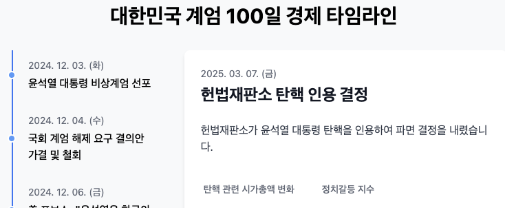
Chart.js: Efficient Data Visualisation Tool
There are several chart libraries available, but I judged Chart.js to be suitable for this project. While D3.js has rich features and high customization freedom, Chart.js is more efficient for implementing linear charts and bar charts of this level. It has the advantages of good documentation and quick results.
import { Line } from 'react-chartjs-2';
import {
  Chart as ChartJS,
  CategoryScale,
  LinearScale,
  PointElement,
  LineElement,
  Title,
  Tooltip,
  Legend,
} from 'chart.js';

ChartJS.register(
  CategoryScale,
  LinearScale,
  PointElement,
  LineElement,
  Title,
  Tooltip,
  Legend
);

// 데이터 구조
const data = {
  labels: ['12-02', '12-03 (계엄)', '12-04', '12-05', ...], // 날짜
  datasets: [
    {
      label: '코스피 지수',
      data: [2800, 2650, 2700, 2680, ...], // 실제 지수 데이터
      borderColor: 'rgb(75, 192, 192)',
      tension: 0.1
    },
    // 다른 지표 데이터셋도 추가 가능
  ],
};

const options = {
  responsive: true,
  plugins: {
    legend: {
      position: 'top',
    },
    title: {
      display: true,
      text: '계엄 선포 전후 코스피 지수 변화', // 동적으로 변경 가능
    },
  },
  // 기타 옵션들...
};

function EconomicChart({ chartData, chartOptions }) {
  return <Line options={options} data={data} />;
}

export default EconomicChart;
EconomicChart.js
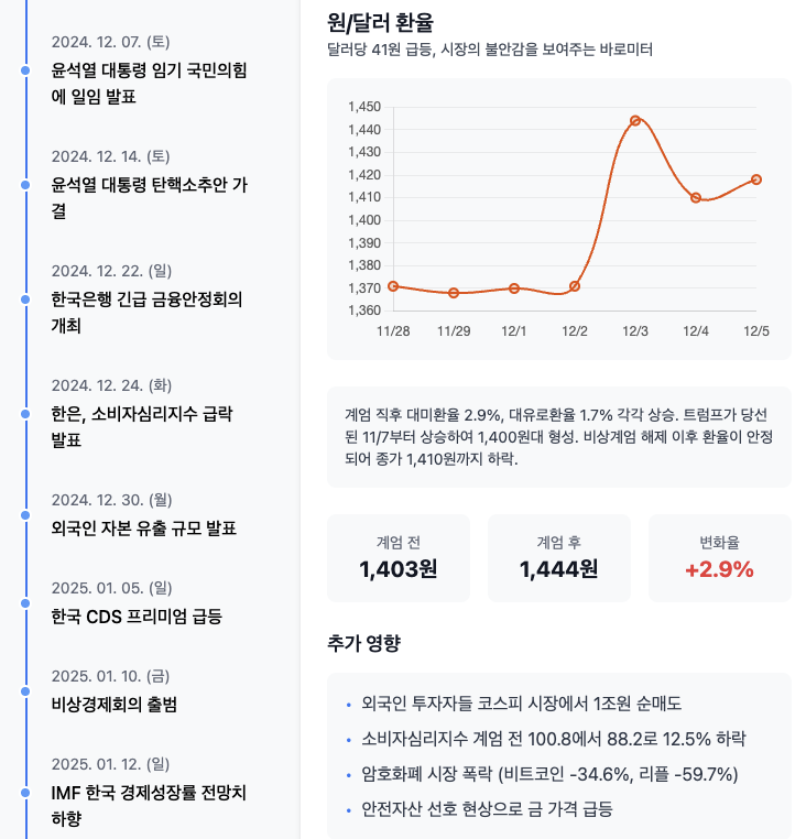
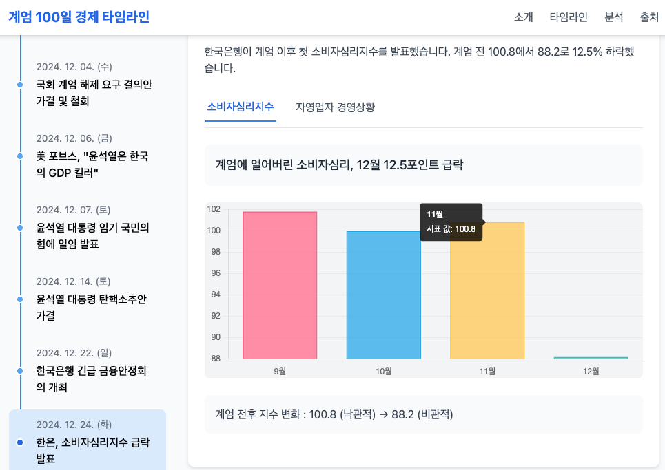
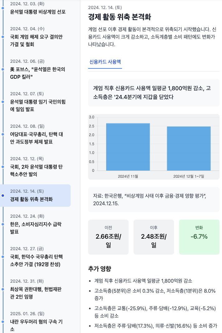
This is how I completed the initial draft work. The mobile version chart below.
I roughly reinterpreted the event and data reports extracted from PDF reports this way and stored the specified values as dataSets properties in the ts file.
Since customising the design individually would take too much time, I didn’t pay much attention to the aesthetic aspect in this project. When I was working on this project, it was late March, and there was a critical situation regarding whether the impeachment trial date for insurrection ringleader Yoon Seok-yeol would be set or not, so the speed of information disclosure was most important.
The Grid system and chart styling provided by Tailwind and Chart.js were already sufficient.
Effective Data Storytelling: Adding Context to Numbers
Just showing charts isn’t enough. Text that explains what the numbers mean and how important those changes are is needed. For this, I conceived the following strategy:
-
Core Message: Concisely express the most important insights in each indicator section
- Background colors set according to indicator characteristics (e.g., Market Cap - teal, Exchange Rate - orange)
- Visual priority given with 24px font size
- Example:
Market cap decreased by XX trillion in one day/Won/Dollar exchange rate broke XXXX won
-
Detailed Information: Display additional information when interacting with cards
- Enhanced user experience with animations
- Readability secured with 18px font size
- Example:
Foreign investors, large-scale net selling occurred/Safe asset preference psychology strengthened, gold prices rose
-
Changes Over Time: Display different messages according to timeline movement
- Deliver different stories for the same indicator depending on time point
- Example: (Initial)
KOSPI, sharp decline→ (100 days later)Shows recovery trend but still unstable
flowchart TD
    Start([User Entry]) --> BasicCard

    subgraph BasicCard ["🔲 Indicator Card (Basic State)"]
        direction TB
        BasicMsg["📋 Core Message<br/>(24px Bold, Background Color)"]
        BasicChart["📊 Chart Area"]
        BasicMsg --> BasicChart
    end

    subgraph ExpandedCard ["🔳 Indicator Card (Hover/Expanded State)"]
        direction TB
        ExpandMsg["📋 Core Message<br/>(24px Bold, Background Color)"]
        Detail1["📄 Detailed Info 1<br/>(18px Normal)"]
        Detail2["📄 Detailed Info 2<br/>(18px Normal)"]
        ExpandChart["📊 Chart Area"]

        ExpandMsg --> Detail1
        Detail1 --> Detail2
        Detail2 --> ExpandChart
    end

    subgraph Timeline ["⏳ Timeline Change"]
        direction TB
        ContentChange["📝 Message Content Change"]
        TimeChange["🕐 Same Indicator, Different Time Point"]
        ContextChange["🎯 Different Context"]

        ContentChange --> TimeChange
        TimeChange --> ContextChange
    end

    BasicCard -->|"🖱️ Hover/Click"| ExpandedCard
    ExpandedCard -->|"↩️ Hover Release"| BasicCard

    BasicCard -->|"📜 Timeline Scroll"| Timeline
    ExpandedCard -->|"📜 Timeline Scroll"| Timeline

    Timeline -->|"✅ Update Complete"| BasicCard

    %% Styling
    classDef basicState fill:#e1f5fe,stroke:#01579b,stroke-width:2px
    classDef expandState fill:#f3e5f5,stroke:#4a148c,stroke-width:2px
    classDef timelineState fill:#e8f5e8,stroke:#1b5e20,stroke-width:2px
    classDef interaction fill:#fff3e0,stroke:#e65100,stroke-width:2px

    class BasicCard,BasicMsg,BasicChart basicState
    class ExpandedCard,ExpandMsg,Detail1,Detail2,ExpandChart expandState
    class Timeline,ContentChange,TimeChange,ContextChange timelineState
This way, data transforms from simple numbers into meaningful stories. We can convey not only the scale of change but also its impact and context.
User Experience Design: The Journey of Information Exploration
Good data visualisation should guide users to naturally explore information. I structured the interaction flow as follows:
-
Timeline Event Selection: User clicks on a specific event (e.g., “Martial Law Declaration”) from the left timeline
- Result: Selected event is highlighted, and the right detail information area updates with that event’s content
-
Economic Indicator Tab Navigation: Provide related economic indicator tabs at the top of the detail information area (e.g., [Market Cap], [Exchange Rate], [Crypto Market])
- Result: Selected tab is activated and information for that indicator is displayed
-
Detailed Data Check: User checks charts and related information for the selected indicator
- Additional Interaction: Hovering over specific points on the chart allows checking exact values
graph TB
    subgraph UI["User Interface"]
        subgraph Left["Left Area"]
            Timeline[📅 Timeline List]
        end

        subgraph Right["Right Area"]
            Detail[📝 Detailed Information]
            Tabs[📊 Indicator Tabs]
            Chart[📈 Chart/Data]
        end

        subgraph Overlay["Overlay"]
            Tooltip[💡 Additional Information]
        end
    end

    Timeline -->|Click| Detail
    Detail -->|Tab Click| Chart

    Timeline -.->|Hover| Tooltip
    Detail -.->|Hover| Tooltip
    Chart -.->|Hover| Tooltip

    %% Style
    classDef leftPanel fill:#e8f5e8,stroke:#4caf50
    classDef rightPanel fill:#e3f2fd,stroke:#2196f3
    classDef overlayPanel fill:#fff3e0,stroke:#ff9800

    class Timeline leftPanel
    class Detail,Tabs,Chart rightPanel
    class Tooltip overlayPanel
Through this structure, users become active explorers rather than passive observers. They can discover insights themselves while directly exploring data, like “Ah, this happened at this time point, and as a result, economic indicators changed like this.”
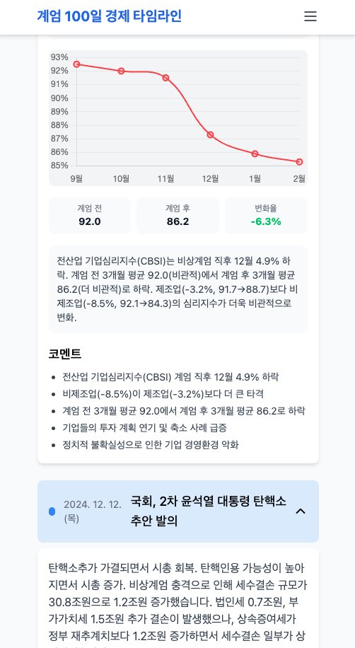
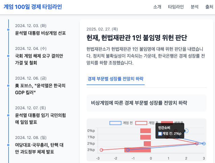
Actually, in some cases, economic indicators change dramatically when events occur (examples: KOSPI index, exchange rate market), but macroeconomic data like consumer indices that require broader economic indicators are difficult to align exactly with the timing of event occurrence. Still, it’s undeniable that the political and economic dynamics became steeper before and after the insurrection occurred. Looking at the cumulative changes over 2-3 months before and after, the performance of the Yoon Seok-yeol administration in 23-24 and before that, and the cumulative figures from before the martial law declaration to after, it will help read quantitative pattern flows of how events that occurred in between may have weighted these cumulative figures.
This is the final chart page that reflects various necessary elements after specifying a prototype for the User Experience of reading related political situations as data while reading event timeline news from all user perspectives.
Current Progress and Next Step
So far, I've implemented basic layout and visualization using Chart.js. It's not perfect, but I've achieved a proof of concept (PoC) level result. The code still needs optimization, but it works functionally for now. What's important in the development process is progress rather than perfection.
For the next step, I’m considering implementing motion graphics using Remotion. Beyond static charts, showing data changes over time through animation would greatly enhance understanding. It could be implemented in a way where charts smoothly change according to timeline scrolling, and related messages appear at appropriate timing.
flowchart LR
    A["🔧 Chart.js Implementation<br/>Static Chart Web Page"]
    B["⚡ Remotion Application<br/>React Components"]
    C["🎯 Motion Graphics Video<br/>Animation Output"]

    A --> B --> C

    classDef stage1 fill:#ffebee,stroke:#c62828,stroke-width:2px
    classDef stage2 fill:#e8f5e8,stroke:#2e7d32,stroke-width:2px
    classDef stage3 fill:#e3f2fd,stroke:#1565c0,stroke-width:2px

    class A stage1
    class B stage2
    class C stage3
Remotion has a learning curve, but it has the advantage of being React-based, allowing us to utilise existing web development knowledge. Especially if we track and visualise economic indicator data up to the moment of Yoon Seok-yeol’s dismissal, it could become a meaningful project that records the economic impact of historical events beyond simple charts.
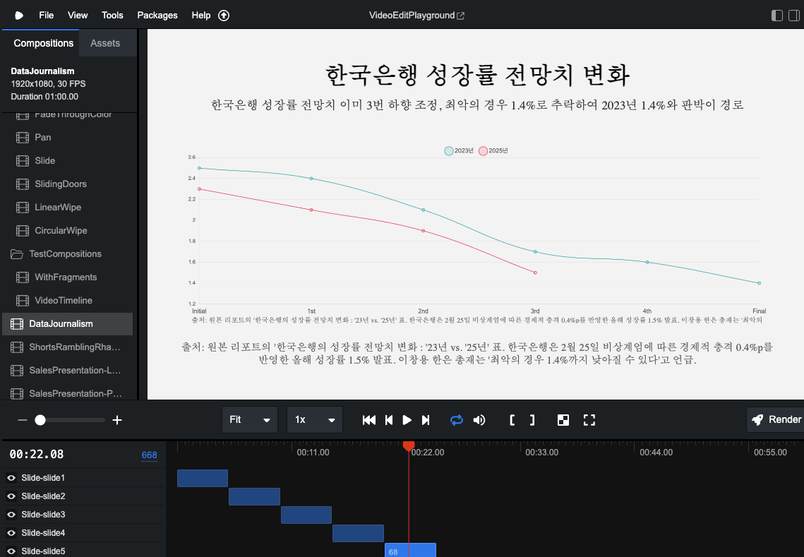
Image: Currently testing the conversion of some of the above economic indicator components into Remotion Chart animations.
If you want to see the live version where the above chart is implemented, click the link below.
Live Version: Economic Indicators for 100 Days After Martial Law (Dec 3, 2024)
100 Days of Martial Law Economic Timeline
Conclusion: The Meaning of Data Journalism
This project is not just a technical experiment, but a process of recording and analysing important events in my own way. While general journaling expresses emotions and thoughts through writing, as a data visual designer, I want to interpret and record the world through code and data.
Ultimately, the data we collect cannot be separated from the politics of life, and visualising this to explain it more understandably and visually is the essence of data visual design. This is probably why I entered a master’s program in data analysis.
Data is not just numbers, but cross-sections of our lives and society. The process of systematically collecting and meaningfully visualising this is another way of recording history. Through this project, my goal is to objectively record social events with the technology I have and help more people understand them easily.
As someone who handles data, our job is to help people listen well to the stories that data tells. This is the way I, as a researcher of data visual design, can contribute. This project is still ongoing, but I’m already gaining many insights. I don’t know how far this process of recording various events in the world through code will go, but I have no choice but to keep trying.